2.3 Arts
Now we will cover the tools of data visualization via ggplot2.
The ggplot2 syntax has three essential components for generating graphics: data, aes, and geom, implementing the following philosophy;
A statistical graphic is a mapping of data variables to aesthetic attributes of geometric objects.
— (Wilkinson 2005)
Coding complex graphics via ggplot() may appear at first intimidating, yet it is very simple once you understand the three primary components:
data: a data frame e.g., the first argument in
ggplot(data, ...).aes: specifications for x-y variables and the variables that differentiate geom objects by color , shape, or size. e.g.,
aes(x = var_x, y = var_y, shape = var_z)geom: geometric objects such as points, lines, bars, etc. with parameters given in the (), e.g.,
geom_point(),geom_line(),geom_histogram()
We can further refine a plot by adding secondary components or characteristics such as
stat: data transformation, overlay of statistical inferences etc.
scales: scaling data points etc.
coord: Cartesian coordinates, polar coordinates, mapping projections etc.
facet: laying out multiple plot panels in a grid etc.
However, don’t worry about learning details. You don’t need to know them all. All you need is a basic but solid understanding of the three primary components that makes up the structure of the ggplot syntax. You can find everything else by Internet search.
Tip #3. Learn to ask questions in Internet search for what you want to accomplish with your custom plots. You will frequently find answers in Stack Overflow.
Let’s generate five common types of plots: scatter-plots, line-graphs, boxplots, histograms, and barplots. To provide a context, we will use these plots to explore potential causes of flight departure delays.
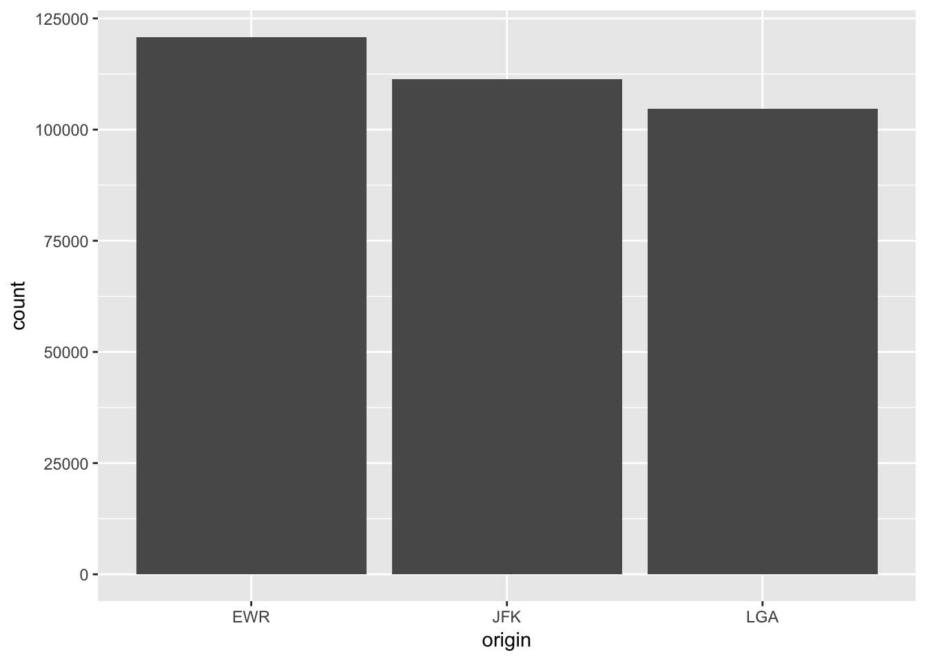
First, let’s consider the possibility of congestion at an airport during certain times of the day or certain seasons. We can use barplots to see whether there is any obvious pattern in the flight distribution across flight origins (i.e., airports) in New York City. A barplot shows observation counts (e.g., rows) by category.
ggplot(data = flights,  # the first argument is the data frame
       mapping = aes(x = origin)) +   # the second argument is mapping, which is aes()
geom_bar() # after "+" operator of ggplot(), we add geom_XXX() elements 
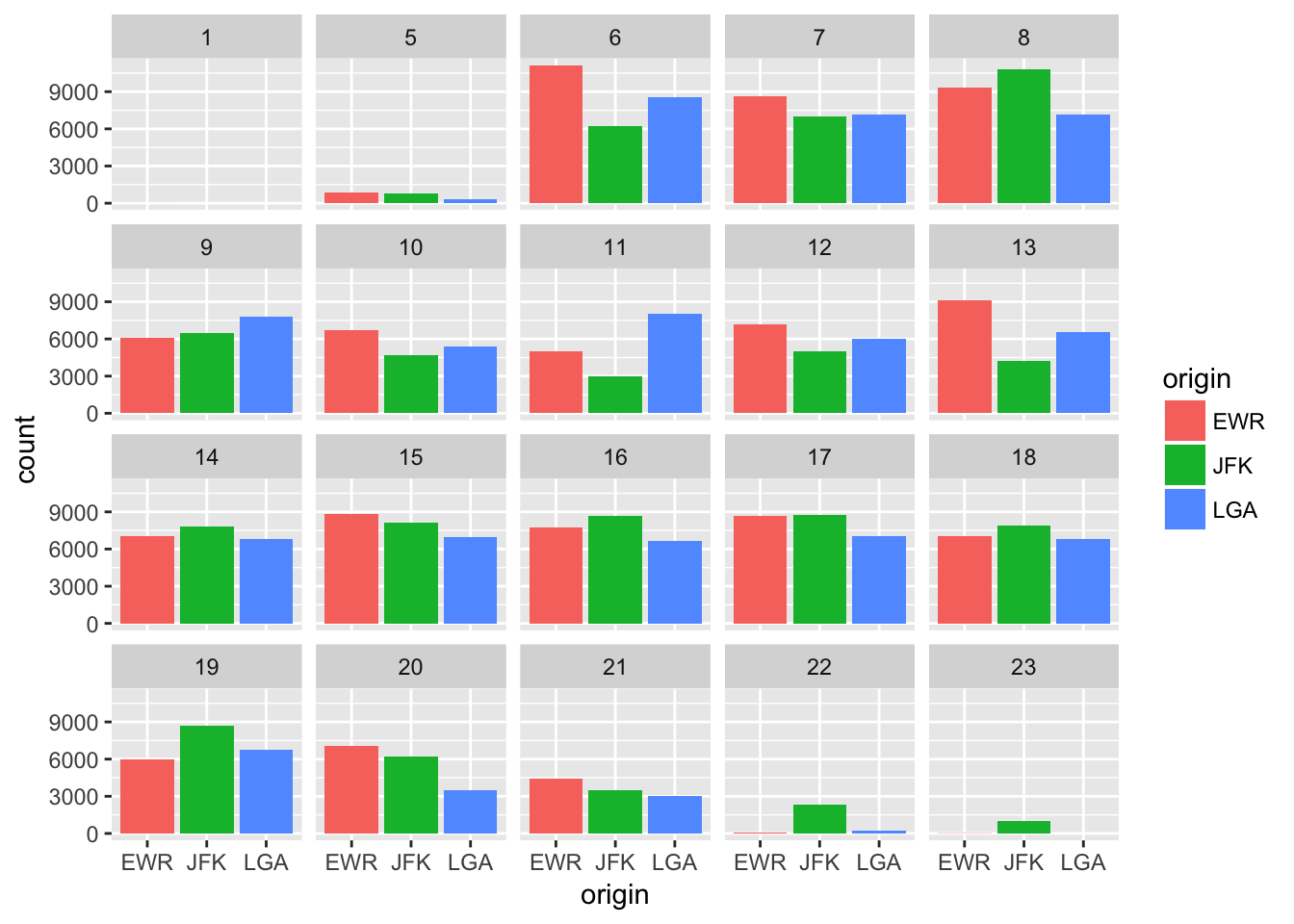
We can make the plot more informative and aesthetic.
ggplot(data = flights,
       mapping = aes(x = origin, fill = origin)) +  # here "fill" gives bars distinct colors
  geom_bar() +
facet_wrap( ~ hour) # "facet_wrap( ~ var)" generates a grid of plots by var 
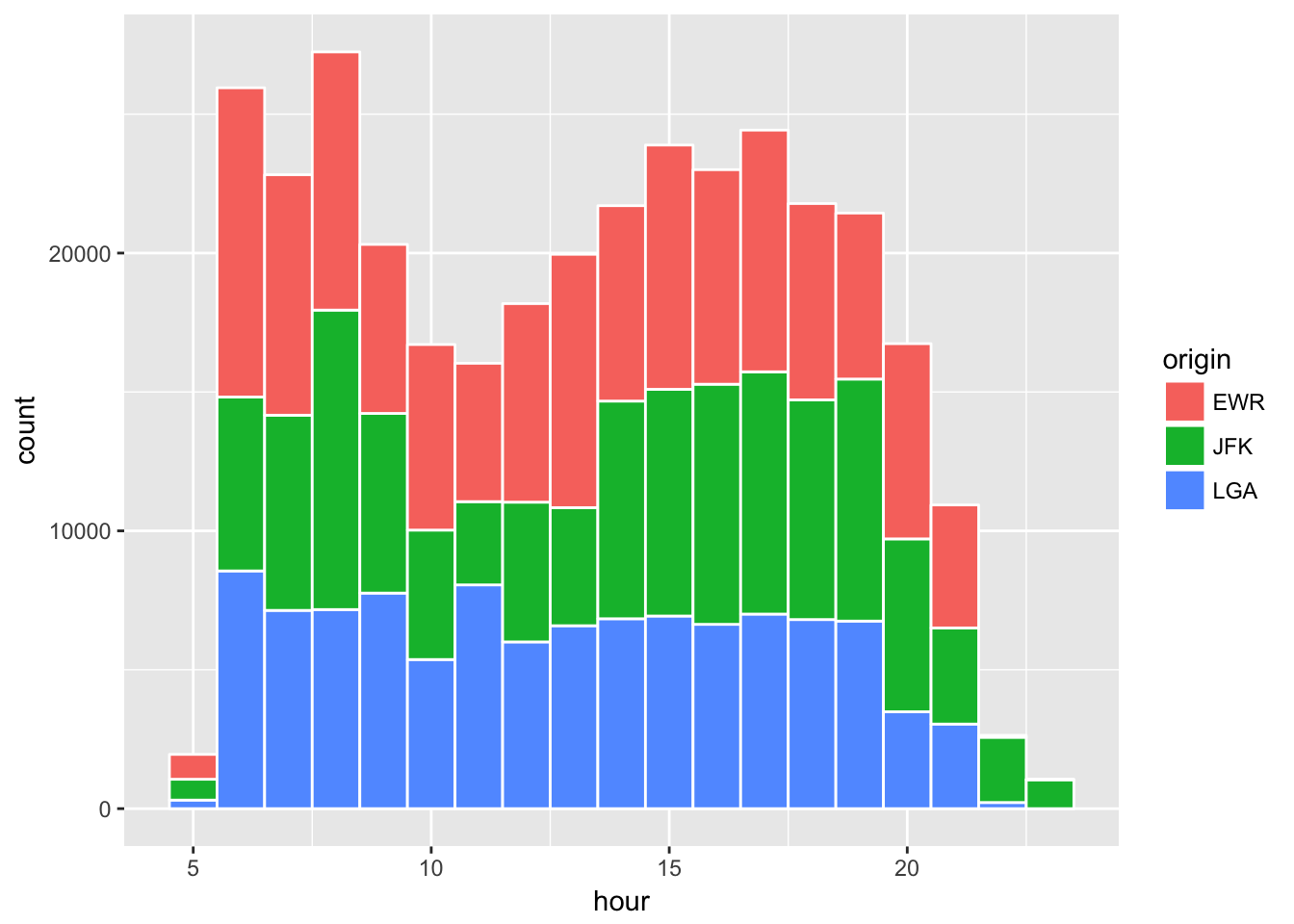
Another way to see the same information is a histogram.
flights %>%
  filter(hour >= 5) %>%  # exclude hour earlier than 5 a.m.
ggplot(aes(x = hour, fill = origin)) + geom_histogram(binwidth = 1, color = "white") 
While mornings and late afternoons tend to get busy, there is not much difference in the number of flights across airports.
Exercise
Generate a bar graph showing the number of flights by carrier in the
flightsdataset. Hint: useaes(x=...)and+ geom_bar().Add color coded origins of flights to the previous graph. Hint: use
aes(x=..., fill=...).Filter the
flightsdata for the date of Janauary 1st and generate a scatter plot of distance and air time. Hint: usefilter(),ggplot(aes(x=..., y=...)), and+ geom_point(alpha=0.1).Add a fitted linear curve to the previous plot. Hint: use
+ geom_smooth(method="lm").Further filter the data for the distance range of [0, 2800] and carrier to be either “AA (American Airways)”, “DL (Delta)”, and “WN (Southwest)” and color-code the graph by carrier. Hint: use
filter(..., carrier %in% c("AA", "DL", "WN"))andaes(x=..., y=..., color=...)andgeom_smooth(method="lm", se=FALSE).
References
Wilkinson, Leland. 2005. The Grammar of Graphics.