4.1 Unusual Deaths in Mexico
Materials
This is a practice session of dplyr and ggplot2 using a case study related to tidyr package.
The case is about investigating the causes of death in Mexico that have unusual temporal patterns within a day. The data on mortality in 2008 have the following pattern by hour;
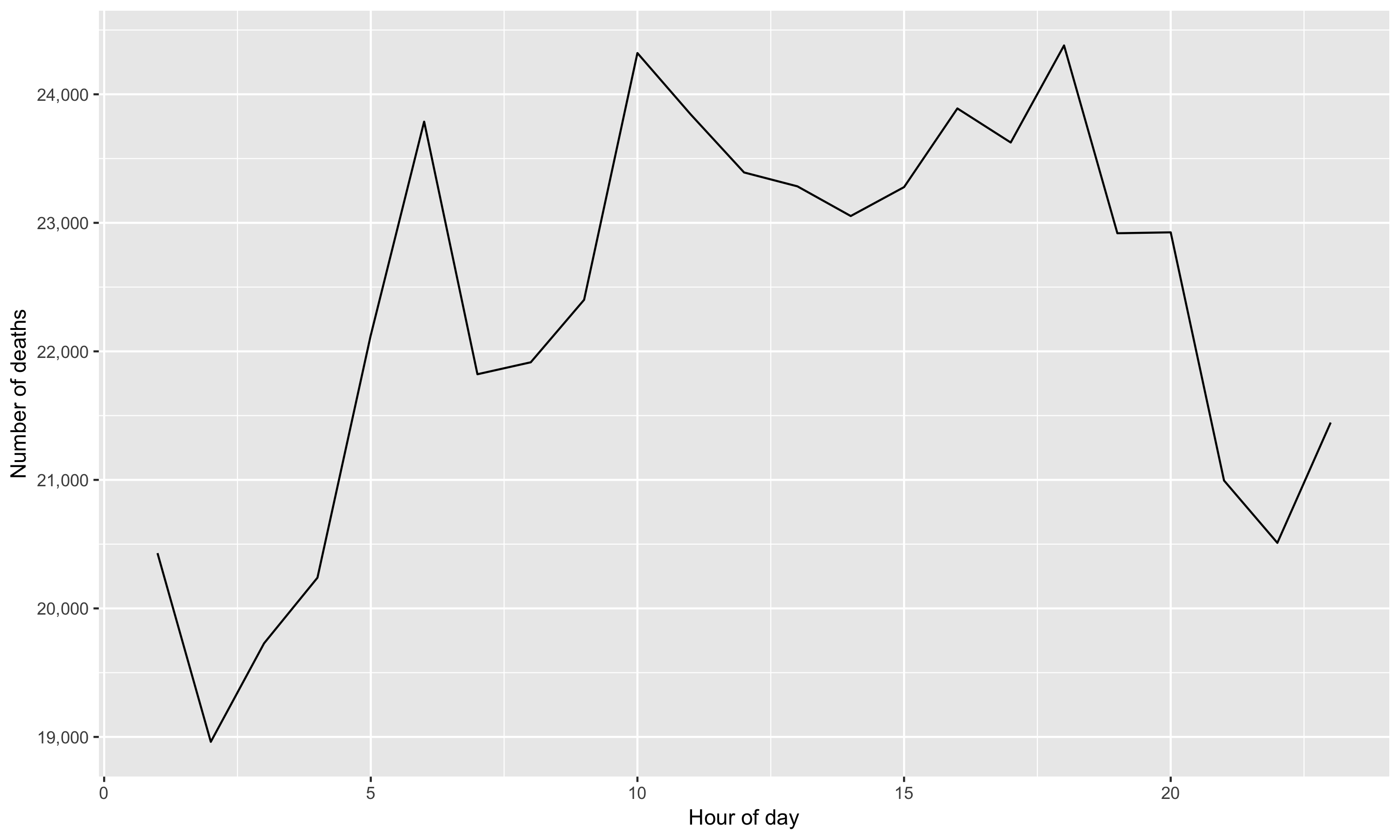
Figure 4.1: Temporal pattern of all causes of death
Do you find anything unusual or unexpected? The figure shows several peaks within a day, indicating some increased risk of death during certain times of the day. What could generate these patterns?
Wickham, the author of the case study, finds;
The causes of [unusual] death fall into three main groups: murder, drowning, and transportation related. Murder is more common at night, drowning in the afternoon, and transportation related deaths during commute times (Wickham 2014).
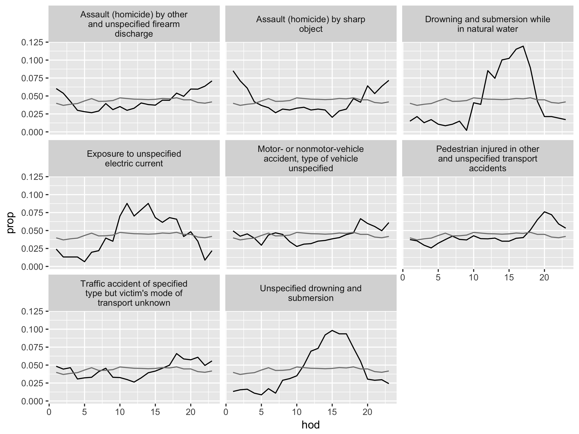
Figure 4.2: Causes of death with unusual temporal courses. Hour of day (hod) on the x-axis and proportion (prop) on the y-axis. Overall hourly death rate shown in grey. Causes of death with more than 350 deaths over a year.
We will use two datasets:
deathscontaining the timing and coded causes of deathscodescontaining the look-up table for the coded causes.
The dataset deaths has over 53,000 records (rows), so we use head() to look at the first several rows.
# "deaths08b" is a renamed dataset with easier-to-read column names
head(deaths08b)
## Year of Death (yod) Month of Death (mod) Day of Death (dod)
## 1 2008 1 1
## 2 2008 1 1
## 3 2008 1 1
## 4 2008 1 1
## 5 2008 1 1
## 6 2008 1 1
## Hour of Death (hod) Cause of Death (cod)
## 1 1 B20
## 2 1 B22
## 3 1 C18
## 4 1 C34
## 5 1 C50
## 6 1 C50The dataset codes has 1851 records.
This table is generated by DT and webshot packages. In the search box, you can type in key words like “bacteria”, “nutrition”, and “fever”, as well as “assault” and “exposure” to see what items are in the data.
We will reproduce this case study and practice using functions of dplyr and ggplot2.
Arts & Crafts
Let’s recap the key ingredients of dplyr and ggplot2 from the introduction in Section 2.
The six important functions in dplyr are:
filter(): extracts rows (e.g., observations) of a data frame. We put logical vectors in its arguments.select(): extracts columns (e.g., variables) of a data frame. We put column names in its arguments.arrange(): orders rows of a data frame. We put column names in its arguments.summarise(): collapses a data frame into summary statistics. We put summary functions (e.g., statistics functions) using column names in its arguments.mutate(): creates new variables and adds them to the existing columns. We put window functions (e.g., transforming operations) using column names in its arguments.group_by(): assigns rows into groups within a data frame. We put column names in its arguments.
We use piping operator %>% (read as then) to translate a sentence of sequential instructions. For example, start with dataset deaths08, then group the data by month of death, and then summarize the grouped data for the number of observations.
deaths08 %>%
  group_by(mod) %>% # mod: month of death
  summarise(nobs = n()) # n(): a dplyr funciton to count rows
## # A tibble: 12 x 2
## mod nobs
## <int> <int>
## 1 1 49002
## 2 2 41685
## 3 3 44433
## 4 4 39845
## 5 5 41710
## 6 6 38592
## 7 7 40198
## 8 8 40297
## 9 9 39481
## 10 10 41671
## 11 11 43341
## 12 12 42265The graphics with ggplot2 consist of three components:
data: a data frame e.g., the first argument in
ggplot(data, ...).geom: geometric objects such as points, lines, bars, etc. with parameters in parenthesis; e.g.,
geom_point(),geom_line(),geom_histogram()aes: specifications for x-y variables, as well as variables to differentiate geom objects by color, shape, or size. e.g.,
aes(x = var_x, y = var_y, shape = var_z)
We specify data and aes in ggplot() and then add geom objects followed by + symbol (read as add a layer of); e.g., ggplot(data = dataset, mapping = aes(x = ...)) + geom_point(). The order of layers added by + symbol is mostly interchangeable.
Combined with %>% operator, we can think of the code as a sentence. For example, consider a histogram of the line-graph for the total number of deaths above. We can formulate the following sequence of steps; “start with dataset deaths08, then plot data via gglpot() where aes() features hour of day on the x-axis and add a player of geom object geom_histogram().”
deaths08 %>%
ggplot(aes(x = hod)) + geom_histogram(binwidth = 1, color = "white") 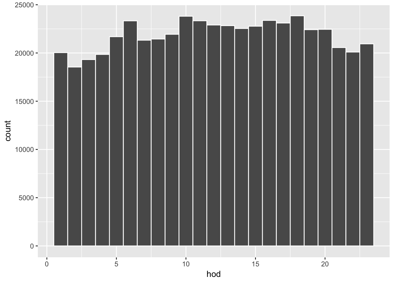
Here are a few more examples.
# a summary by month of day and hour of day.
# e.g, Jan-1am, ..,Jan-12pm, Feb-1am,..., Feb-12pm, ...
n_month_hour <- deaths08 %>%
  group_by(mod, hod) %>%
  summarise( nobs = n() )

n_month_hour %>%
  ggplot(aes(x = hod, y = nobs, color = as.factor(mod))) +
geom_point() 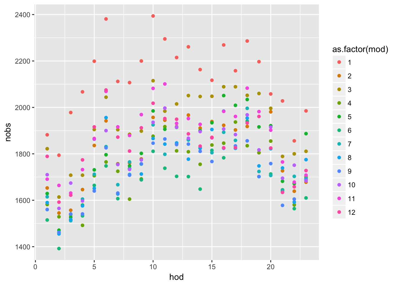
# "last_plot() + " allows for adding more layers to the previous plot
last_plot() + geom_line()
Exercise
Now it is your turn. The exercise is to reproduce the above results for the unusual causes of deaths.
Download materials: case study paper and case study data
Set working directly:
setwd(your_directory)Load libraries:
library(dplyr),library(ggplot2),library(MASS)(used for fitting data by robust regression)
Note 1: There is a minor error in the case study where the author accidentally kept several records of data from years other than 2008. This has virtually no effect on the results, and we are seeking to reproduce the same results as in the case study.
Note 2: You could look at the code in the paper for hints. However, the code is written with the functions of plyr package, which is sort of like a predecessor of
dplyr.
Speaking of plyr, when loaded together, plyr and dplyr can cause namespace issues (having the same function names from different packages!). plyr namespace is automatically loaded with ggplot2. If you type ?summarise and ?arrange you will see that these functions are loaded from the two packages.
This problem is not uncommon in R, as notified upon loading packages by the warnings about masked functions. To call a function from a specific package, use double-colon operator (e.g., dplyr::summarise()). The reference before :: is called namespace, and you can find out all namespaces loaded in the current session;
loadedNamespaces()## [1] "Rcpp" "knitr" "bindr" "magrittr" "grDevices"
## [6] "munsell" "colorspace" "R6" "rlang" "plyr"
## [11] "stringr" "dplyr" "tools" "utils" "webshot"
## [16] "DT" "grid" "gtable" "xfun" "htmltools"
## [21] "stats" "datasets" "lazyeval" "rprojroot" "digest"
## [26] "assertthat" "tibble" "base" "bookdown" "bindrcpp"
## [31] "ggplot2" "htmlwidgets" "graphics" "glue" "evaluate"
## [36] "rmarkdown" "stringi" "compiler" "pillar" "methods"
## [41] "scales" "backports" "pkgconfig"For example, the following commands produce different results;
mtcars %>% group_by(cyl) %>% dplyr::summarise(avgwt = mean(wt))## # A tibble: 3 x 2
## cyl avgwt
## <dbl> <dbl>
## 1 4. 2.29
## 2 6. 3.12
## 3 8. 4.00mtcars %>% group_by(cyl) %>% plyr::summarise(avgwt = mean(wt))## avgwt
## 1 3.21725One way to ensure that we refer to dplyr functions, we can overwrite function names and pass the arguments;
# force function namespace for key dplyr functions
select <- function(...) dplyr::select(...)
filter <- function(...) dplyr::filter(...)
arrange <- function(...) dplyr::arrange(...)
summarise <- function(...) dplyr::summarise(...)
summarize <- function(...) dplyr::summarise(...)
mutate <- function(...) dplyr::mutate(...)
group_by <- function(...) dplyr::group_by(...)
Part A. Display overall hourly deaths
We will reproduce the following plot:

Hints:
Filter
NAin the hour of day (hod) variable and define a new datasetUse
group_by(),summarise(),n()to obtain death counts by groupUse
ggplot() + geom_line()to produce plotUse
+ labs( x = "x lable", y = "y label")for axis labelssee help file of
scale_y_continous()for comma (use?function_namefor help)
Part B. Count deaths per hour, per disease
We will reproduce the following table:
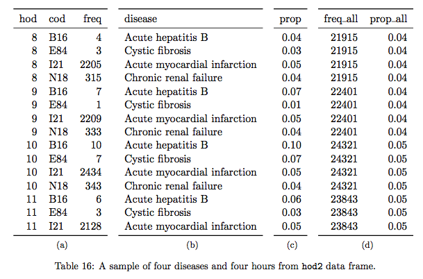
The table shows the first 15 rows of a transformed dataset. Panel (a) shows a frequency (i.e. the number of rows) for each combination of hour of day (hod) and cause of death (cod), supplemented by the disease description in panel (b). Panel (c) shows the proportion (prop) of these combinations within the cause of death; which likely a given cause of death is observed across hours of the day? Panel (d) presents the overall hourly death counts and rates (freq_all and prop_all); if every hour has the same probability of death, we would see prop_all \(\approx\) 0.042 (i.e., 1/24).
Here, we see the author’s idea of identifying “unusual deaths” by looking at how “prop” of each hod-cod pairs deviates from “prop_all” (see figure 4.2). What would this comparison mean? Intuitively, we can think of “prop_all” as the normal death rate in a given hour. The key here is to recognize how the author defines unusual deaths. Clearly, there are a small set of common causes of death and a large set of many rare (and obscure) causes of death. The causes of death that are simply rare are not particularly interesting to examine. Here, the author defines unusual deaths as the deaths occurred in unusual hours of the day and examines the associated causes. The variable “prop” describes how each cause of death appears each hour of the day as its total proportion of deaths by that cause.
Hints for creating panel (a)
Use more than one variable in
group_by()Use
summarise()withn()to obtain death counts by group
Hints for creating panel (b)
- Use
left_join()to add the information from datasetcodes
Hints for creating panel (c)
- Use
mutate()withsum()on the joined dataset above
Hints for creating panel (d)
Create a new data frame by using
summarise()on the joined and mutated data frame above.summarise()will reduce the dimension of the data frame to its summary, which is the basis of panel (d). Once the desired summary is created, merge it to the data frame of panels (a)-(c).Before using
summarise()above, usegroup_by()to specify new groupingFirst create
freq_allvariable viasummarise()withn(), useungroup(), then createprop_allvariable viamutate()withsum(). Call this data frameoverall_freq, which will be used again at the very end.Use
left_join()to join panels (a)-(c) and panel (d) (overall_freq), which we refer to asmaster_hoddata frame.
Hints for displaying the same rows as in the Table 16 above
Create a subset of the
master_hoddata under a new nameUse
filter()to selectcodbeing either “I21”, “N18”, “E84”, or “B16” andhodbeing greater or equal to 8 and smaller or less than 11Use
select()to pick columns in a desired order andarrange()to sort
Part C. Find outliers
We will reproduce the following plots:
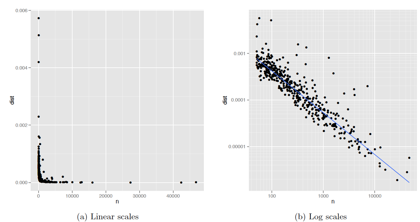
Figure 4.3: Figure 2: (a) Plot of n vs deviation. Variability of deviation is dominated by sample size: small samples have large variability. (b) Log-log plot makes it easy to see the pattern of variation as well as unusually high values. The blue line is a robust line of best fit.
We will create a deviation variable named dist by taking the mean of squared differences between prop and prop_all. The above figures show the the number of deaths n by each cause of death and this distance measure dist in the raw-data scale (left) and in the log scale (right).
The author’s intuition is that we may observe a pattern that the more common the cause, the smaller the deviation (dist) tends to be. The author uses a linear model to account for such a relationship between the variability and sample size in the logarithmic scale. Once the model is defined and estimated, we can identify “outliers” that deviate largely from its prediction. Those outliers then become the candidates for usual deaths.
Hints
Use
group_by()andsummarise()on themaster_hoddata frame to generatenwith functionsum()anddistbymean((prop - prop_all)^2)Filter this summary for
n > 50and call itdevi_cod(deviations by cause of death)Use
ggplot() + geom_point()withdata = devi_codto produce the raw-scale figureAdditionally use
scale_x_log10(),scale_y_log10(), andgeom_smooth(method = "rlm", se = FALSE)to produce the log-scale figureSee help for
scale_x_log10()to adjust axis labels (look for “comma”)Technically speaking, we should change the axis labels to indicate the logarithmic transformation, but we skip it here.
Let’s not worry about reproducing the exact grids as they appear in the paper
Part D. Fit data by a regression and plot residuals
We will reproduce the following plot:
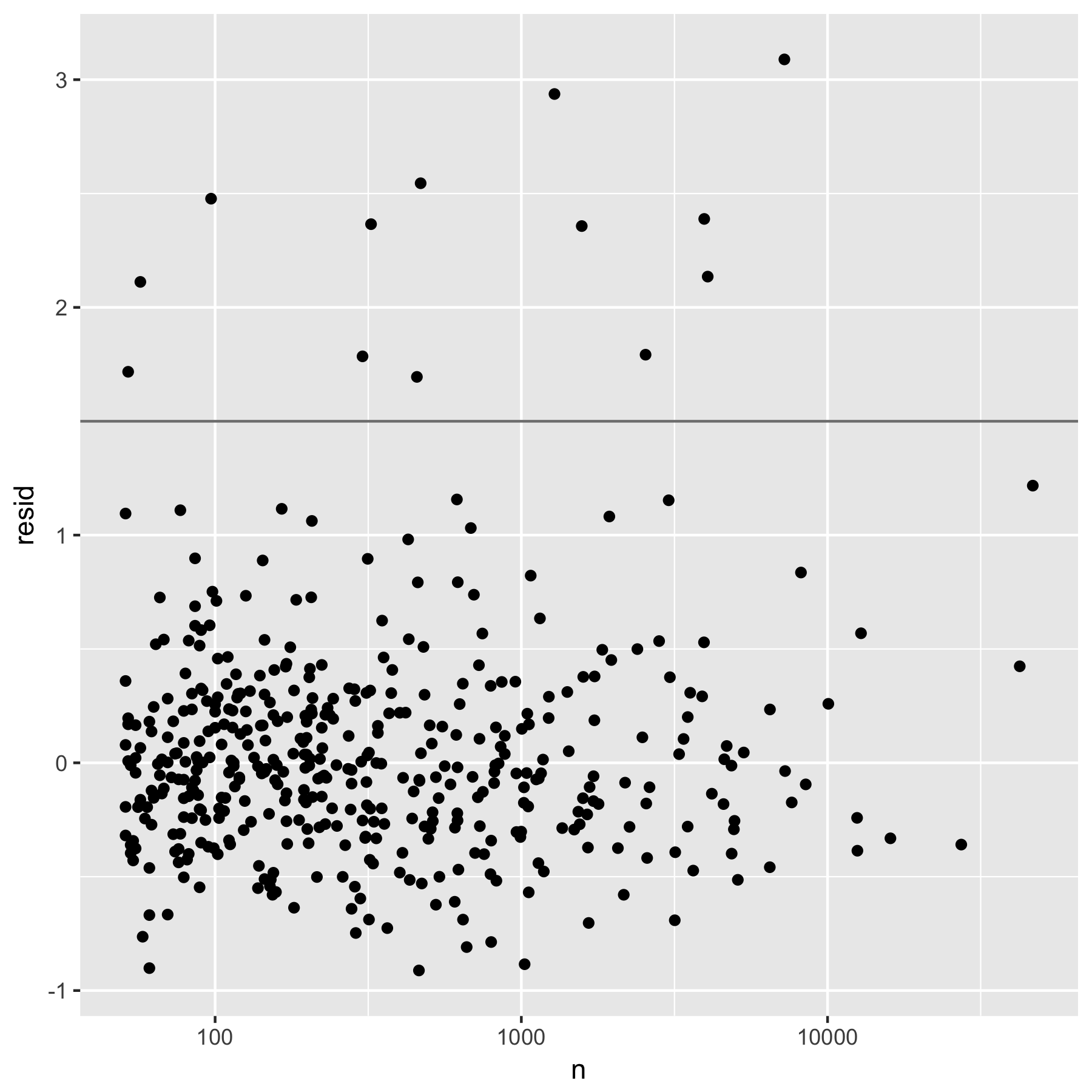
Figure 4.4: Figure 3: Residuals from a robust linear model predicting log(dist) by log(n). Horizontal line at 1.5 shows threshold for further exploration.
The figure is a plot of the regression residuals resid of log(dist) on log(n). By visual inspection, the points lying above the horizontal line at resid=1.5 are considered to be “unusual causes of deaths” by the author.
Here the author used the robust linear model (rlm()) regression, but the syntax is mostly the same as that of the standard linear model regression (lm() ).
Here is an example of regression by lm().
df <- data.frame(
  x1 <-  c(1:10),
  y1 <-  c(1,3,2,4,6,5,7,5,7,8)
)

df %>%
  ggplot(aes(x = x1, y = y1)) + geom_point() +
  geom_smooth(method = "lm", se = FALSE)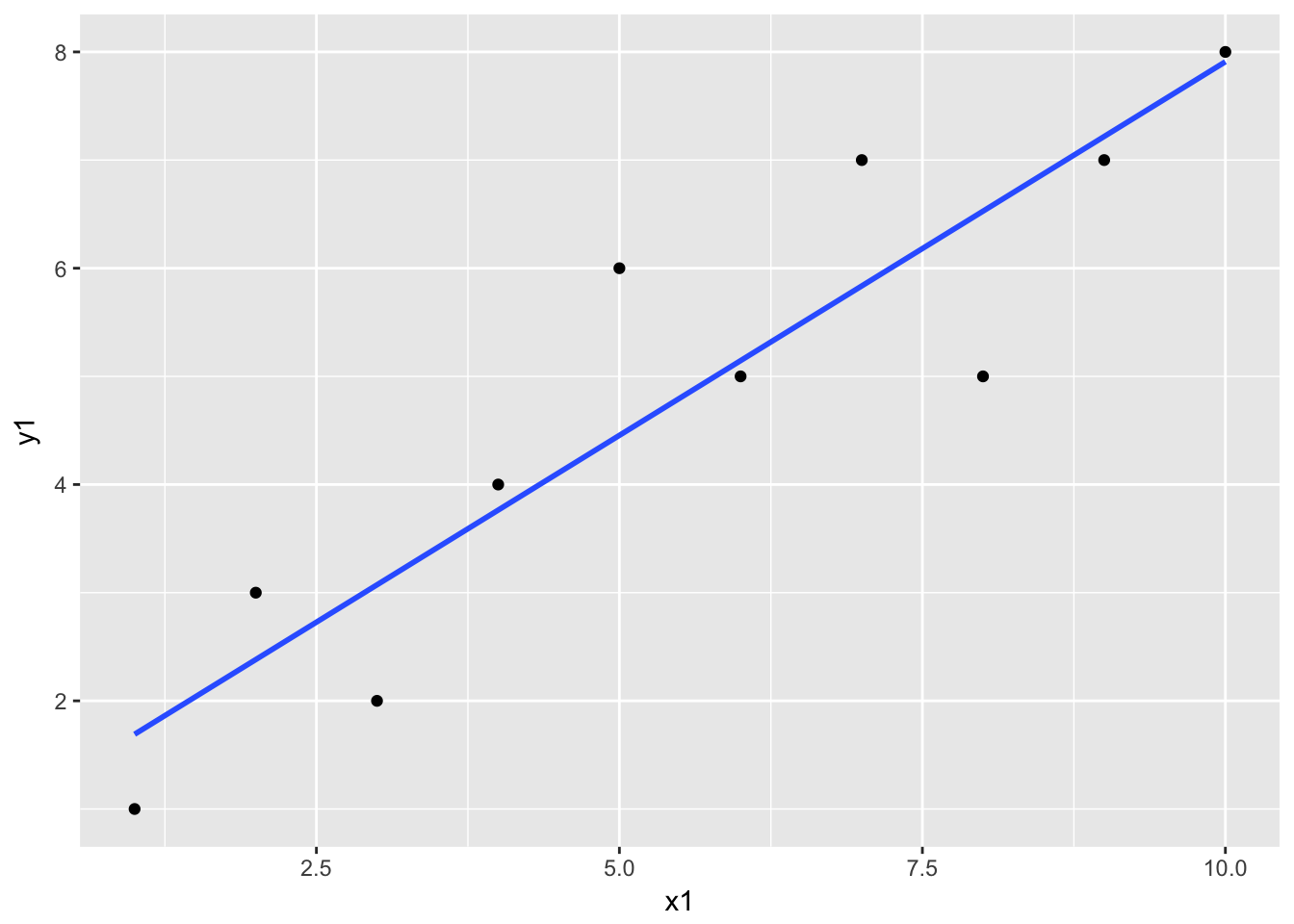
The geom_smooth() is estimating the following linear regression: \[ y1 = intercept + coefficient * x1 + residual\] The model is estimated by lm() as follows;
f1 <- lm(formula = y1 ~ x1, data = df) Let’s see what we get out of the estimation results f1.
class(f1) # class "lm"## [1] "lm"summary(f1) # summary() knows how to summarise an object of class "lm" ##
## Call:
## lm(formula = y1 ~ x1, data = df)
##
## Residuals:
## Min 1Q Median 3Q Max
## -1.52727 -0.57273 -0.02727 0.52273 1.54545
##
## Coefficients:
## Estimate Std. Error t value Pr(>|t|)
## (Intercept) 1.0000 0.6924 1.444 0.186656
## x1 0.6909 0.1116 6.192 0.000262 ***
## ---
## Signif. codes: 0 '***' 0.001 '**' 0.01 '*' 0.05 '.' 0.1 ' ' 1
##
## Residual standard error: 1.014 on 8 degrees of freedom
## Multiple R-squared: 0.8273, Adjusted R-squared: 0.8058
## F-statistic: 38.34 on 1 and 8 DF, p-value: 0.0002618coefficients(f1) # coefficient point estimate## (Intercept) x1
## 1.0000000 0.6909091vcov(f1) # coefficient variance-covariance matrix## (Intercept) x1
## (Intercept) 0.47939394 -0.06848485
## x1 -0.06848485 0.01245179predict(f1) # predicted (fitted) values with the estimated coefficients ## 1 2 3 4 5 6 7 8
## 1.690909 2.381818 3.072727 3.763636 4.454545 5.145455 5.836364 6.527273
## 9 10
## 7.218182 7.909091resid(f1) # residuals: ## 1 2 3 4 5 6
## -0.69090909 0.61818182 -1.07272727 0.23636364 1.54545455 -0.14545455
## 7 8 9 10
## 1.16363636 -1.52727273 -0.21818182 0.09090909Let’s get back to our exercise and reproduce the figure above.
Hints
Run a regression by
rlmwithformula = log(dist) ~ log(n)and store the residuals indevi_coddata. To read more about linear regressions, see the help file oflm()(type?lm). For adding a column of residuals, you can use assignmentdevi_cod$resid <- your_residuals.Plot the residual against log-scale
nNote: Check the dataset
devi_codfor missing values ofdistandnbefore running a regression (you should not have missing values in this case). Most regression functions, includinglm()andrlm(), drop any row with missing values. This becomes an issue if we want to add a new column containing predicted values or residuals to the original dataset. (When rows containing missing values are dropped, the vector generated bypredict()orresid()will be shorter than the number of rows in the original dataset.)Use
ggplot() + geom_point()structure for the plotAdd
+ scale_x_log10()and+ geom_hline(yintercept = 1.5)
Part E. Visualize unusual causes of death
We will reproduce the following plots:

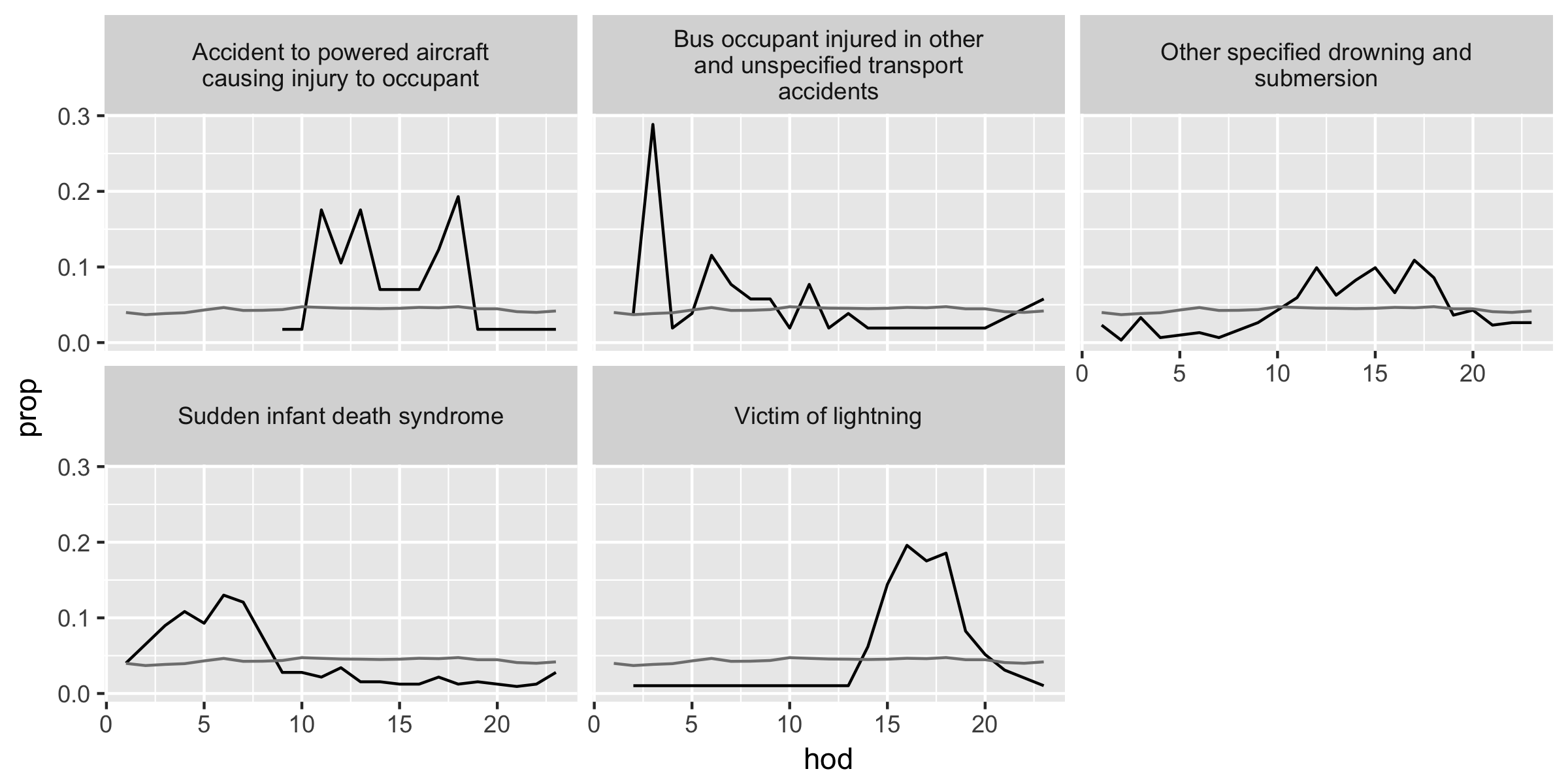
The first figure is the unusual causes of deaths in devi_cod with a relatively large number of deaths (n > 350) and the second is that of a relatively small number of deaths (n <= 350).
Hints
Using the cut-toff value
resid > 1.5, filterdevi_codand call itunusualdata frame. Joinmaster_hodandunusualdata frames. Then create two subsets of data with conditionsn > 350andn <= 350.Use
ggplot() + geom_line()structure with+ facet_warp(~ disease, ncol = 3)To include the overall hourly proportions of deaths (
prop_all) representing the average of all causes of deaths in a given hour, add another layer bygeom_line(aes(...), data = overall_freq)with a localaes()argument and a data argument. With the data argument, variables in another data frame can be combined (assuming the axes have the same measurements), and here we use theoverall_freqdata frame from the panel (d) portion of Table 16 above.last_plot() %+% another_data_framereproduces a plot of the same structure with a different data frame
The Key
Reflections
Let’s recap. The author (Wickham) investigates the temporal pattern of death in Mexico to find the causes of death that have unusual temporal patterns within a day. Here are the five steps used in his approach.
A. Visualize the overall hourly frequency of death within a day
B. Construct variables to compare the proportion of death for each hour per cause against the overall proportion of hourly death
C. Plot the data to identify a general relationship among key variables
D. Create a linear model (i.e., data point = model prediction + residual)
E. Visualize the temporal pattern of the “unusual” cases, or the causes of death that have relatively large residuals
While these steps may not serve as a template for your data analysis, the thought process and techniques in the above exercise will be applicable to various situations.
In case you need to see more examples, here are additional dplyr and ggplot2 tutorials.
References
Wickham, Hadey. 2014. “Tidy Data.” The Journal of Statistical Software 59 (10). http://www.jstatsoft.org/v59/i10/.